NESPRESSO
Web Design + Marketing Research
A new caffeine-infused journey for younger coffee lovers.
Type . Web Design Class Project
Duration . 2019 April - May | 6 weeks, part time
Method . Marketing Research, User Research, Visual Research, Wireframes, Mockups, Prototype
Tools . Illustrator, InDesign, Adobe Xd, Pen & Paper
the WHY
Nespresso is an established brand for coffee and espresso machines. Most of the existing customers enjoy the convenience of the system, the boutique store experience, and it is perceived as a luxury product.
Through user research, two key challenges were identified; firstly, both the quality and the selection of coffee could be improved, and secondly, younger demographics do not identify with the brand.
the HOW
My solution to these challenges was to create a limited-edition coffee collection in collaboration with local coffee roasters in Vancouver. This would offer a discovery experience to existing club members, and would reach more coffee lovers and a younger audience. It also supports the local community and offers them the opportunity to collaborate with an industry leader like Nespresso.
the WHAT
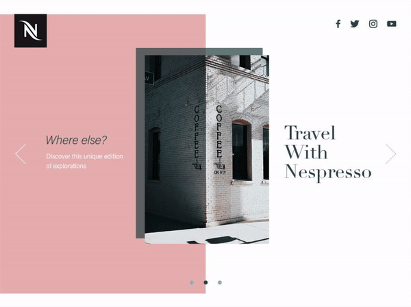
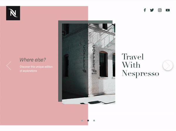
For this project, I created a website to communicate the launch of a new coffee experience that conveys a lifestyle that younger audiences relate to and can emotionally engage with.
EXPECTED IMPACT
Increase brand awareness by reaching a different demographic.
Cater the brand toward coffee lovers who care about the taste of their coffee and are inclined to share their interests.
A longer customer relationship can be built with a younger audience.
Being perceived as an active participant in the local economy.
Continue to add value and exclusivity to existing club members.
MARKETING RESEARCH
The innovative Nespresso machine was created in 1986, and the design has seen many iterations over the years. The company’s core tenets are high quality, continuous innovation, sustainability, and exclusivity. Their marketing appeals to an older demographic that don’t cherish the experience of going to coffee shops, but prefer to have this convenience at home. This project aimed to combine the aesthetic and ease of use of Nespresso machines, with the lifestyle and sense of community that local coffee shops offer.


VISUAL RESEARCH
Nespresso’s website immediately appears too luxurious and expensive for younger audiences. The use of a monochromatic colour scheme, geometric shapes, and disengaging imagery won’t spark the interest of young coffee-lovers in Vancouver. By contrast, the branding of local coffee shops in the city is usually colourful, uses youthful illustrations, and informal language.

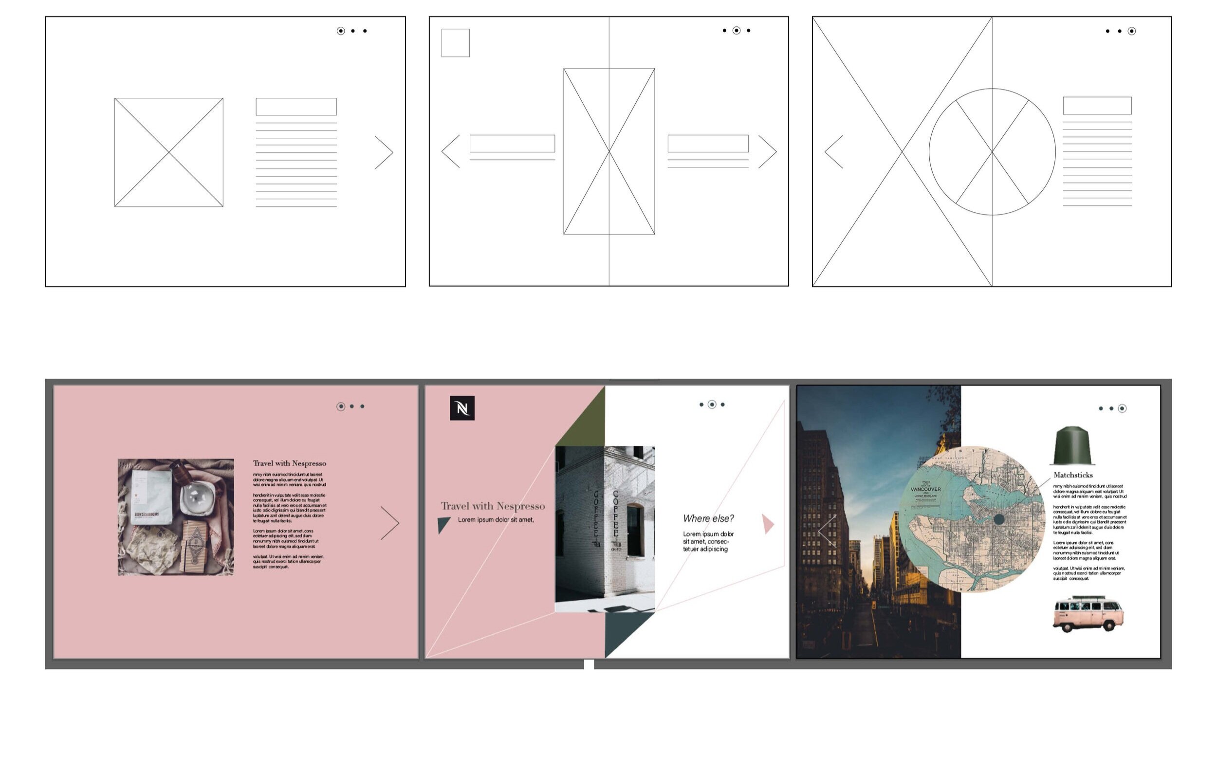
DESIGN PROCESS
Grey was chosen, along with a soft pink for the design. These complimentary colours fit within Nespresso’s aesthetic of modern, simple, and elegant, while adding a youthful feel.
Both serif and sans-serif typefaces were used to create contrast and clearly define hierarchy. Geometric shapes were included to reflect Nespresso’s existing quality brand. The process began with collating moodboards as inspiration, before moving on to design initial and final concepts.