
BLABLA
Mobile App Design (VUI)
A fun and interactive app to learn more about your communication habits and improve your interactions with others.
Type . Mobile App Design Class Project
Duration . 2019 July - August | 4 weeks
Method . Affinity Diagrams, Paper Prototypes, Wireframes, User Testing
Tools . Illustrator, Adobe Xd, Pen & Paper
the WHAT
Blabla is a fun and interactive way to learn and improve your communication habits. Through recordings, the user can better understand patterns in their speech, and gain insight into how their communication style is effecting day-to-day personal interactions with others.
Many adults reach a point when they stop trying to discover new things about themselves. My goal was to create an app that would be informative, interactive, and fun, because we retain information when we feel positive about the learning process.
the WHY
“I feel like I’m not being heard or understood.”
“I want to get better at verbally expressing myself.”
We all have our own communication style and talking habits. We tend to repeat certain words and use a different tone of voice depending on who we speak with. It’s something we tend not to notice unless our family, friends, or colleagues point it out to us. Studies on effective communication show that good verbal skills can prevent and resolve conflicts, improve our relationships with others, and give us more self-confidence. In a nutshell, good communication skills can improve our overall wellbeing.
the HOW

Users are guided through Blabla’s Voice User Interface (VUI) through a series of prompts by its native virtual assistant.

Blabla listens to speech and analyses the conversation based on speed, volume, tone, and semantics.

Receive real-time feedback on your communication patterns, suggestions on conversation style and alternative words.
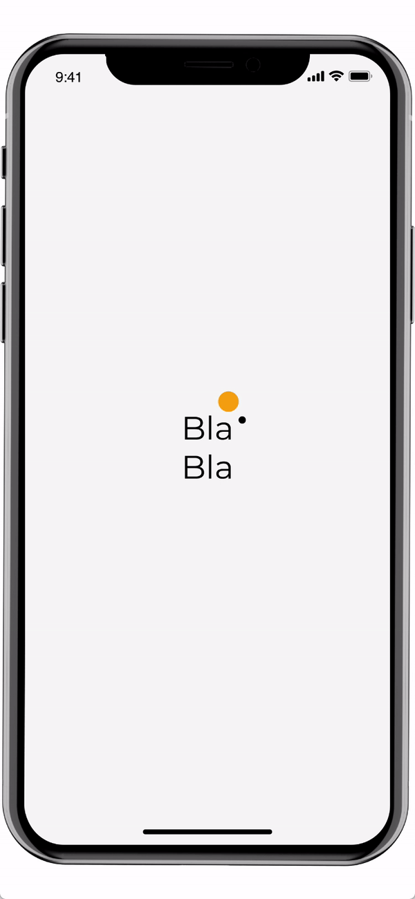
the SPLASH

The animated splash page creates anticipation, while making the user feel welcome.
It allows time for users to get ready so that they aren’t suddenly addressed by the virtual assistant.
the ONBOARDING

Pauses between each command create a smoother human-machine interaction.
Visual cue indicates when the app is in active listening state.
Real-time text feedback is given as the user speaks.
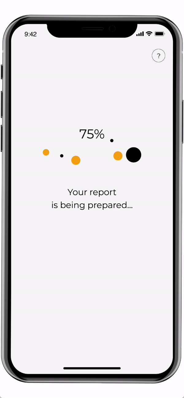
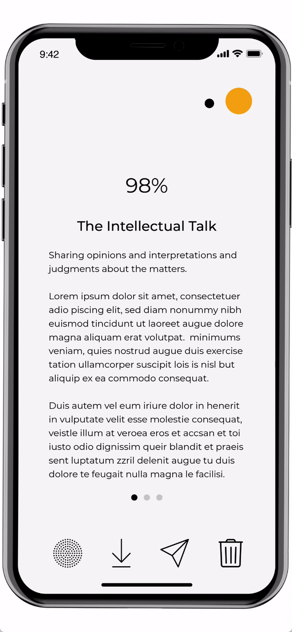
the REPORT

A percent-to-completion animation distracts the user to make the wait more pleasant.
A change of pace in the animated bubbles indicates active listening is on.
Virtual assistant shrinks to a minimized view to make room for the report.
the BRANDING

The name Blabla is catchy, and a fun alternative to the word "communication”.
I have chosen a sophisticated, warm-colour palette of charcoal black, off-white and mustard yellow. Using an off-white background conveys calmness, comfort and hope. Mustard yellow can energize and stimulate the mind and increase positive emotions.
Circles convey playfulness and harmony while the Montserrat typeface creates a modern yet professional look. To ensure the app is inclusive of those who are visually impaired, it uses the larger x-height to make the text more visible.
the PROCESS
Blabla started after being assigned “Health Care” as a prompt for a class project. After brainstorming, thinking about my own experiences, and gaining insights from my peers, I knew that my focus had to be Mental Health.
NARROWING DOWN THE FOCUS AND EXPLORING FURTHER:
In order to understand the Mental Health field in more depth, and find out what issues we are currently facing as a society, I started researching online and reading articles related to the topic.
Words that stood out during my research: wellbeing / happiness / self-care / positive thinking / social / communication.
ORGANIZING THOUGHTS:
After interviewing with peers and friends, I discovered that people’s awareness regarding wellbeing was centred/built around the core idea of maintaining good mental health, as opposed to improving poor mental health. I felt more strongly about creating an app around positive thinking and change behaviour patterns.
FOCUSING MY IDEAS:
The idea of improving communication skills came up while having coffee with a friend. The pain point came from personal experience.
“I was feeling frustrated so I asked a friend to meet for coffee. He listened to me then shared his thoughts. He meant well, but I felt my feelings were not being heard and understood.”
I realized that intentional, thoughtful wording and tone can make any interaction more positive. Blabla was created with this in mind.

I studied Maslow's hierarchy of needs, and it shows that as humans we communicate to meet a range of different needs. Good communication skills are especially important to satisfy the psychological needs, such as belongingness and esteem.

EARLY-STAGE CONCEPTUALIZING:
I made a flow chart to help visualise the overall idea and the features of the app.
CONCEPT TESTING:
Blabla’s first user testing was conducted by sharing a set of quick drafted paper prototypes with peers. Feedback was received on both the user experience and concept itself.

1ST ITERATION:
Based on the feedback and observations from user testing, I made some changes including:
Clear instructions for the Voice User Interface design.
Begin by asking the occasion of the conversation.
Option to send reports to a single user, or both users having the conversation.
Option to delete recordings.
2ND ITERATION:
Simplified onboarding. Users were given the option to skip this process.
Added prompts to establish what type of conversation the user was recording, e.g. a casual chat with a friend, a business meeting, or a family discussion.
Wrote script for native voice assistant.

LATEST ITERATION:
Additional user testing was conducted with a group of two, then just one, in order to get feedback on the single-user experience. Here are the changes I made:
Decided on the app name.
Removed the hamburger menu on onboarding.
Reviewed and redesigned the onboarding questions and procedure.

the VISUAL

I wanted to create an app that would be fun and interactive, and the visual design had to live up to that goal.
The visual qualities such as retro-futuristic / psychedelic / nostalgic / past pop culture triggered feelings of playfulness and memory.
When I started looking for visual inspirations, some TV shows and product designs from the 80’s came to mind.
There are similarities between the popular culture of the 80’s and ours now. We still have the same sense of excitement about the future of technology. Smarter products are emerging every day, and we become increasingly fascinated by them.

Two different approaches on retro-inspired design. One takes on the idea of nostalgic / 80’s product design while the other is about retro-futuristic and psychedelic.
VISUAL FEEDBACK:

1. Retro-inspired and minimalist:
Reminded users of vintage Braun products and made they feel nostalgic.
Feels like a physical product more than just an app screen.
Visually comfortable and easy to use.
There is a sense of safety and trust.

2. Retro-futuristic and psychedelic:
Speaks of fun and playfulness, but may not be sophisticated enough for a Mental Health app.
The colour scheme is too dark and unwelcoming.
Feedback showed that the more approachable and comfortable option was the best fit for the app.

REFLECTIONS:
Given that the app is aimed at users who would like to improve their communication, and overall Mental Health, I should have consulted mental health professionals on the concept during the design process.
After the project I consulted a psychologist about Blabla, and effective communication in general. She suggested ways to measure some communication patterns including airtime, interruptions, domination, positivity vs negativity and nonverbal (tone of voice). Her insight was invaluable, and allowed me to better understand congruent communication. This form of communication is non-judgemental and includes empathy, respect, genuineness and participation. This type of communication generates positive outcomes and experiences. Prompts from Blabla should reference the individual qualities of this speaking style, identifying when a user is not implementing congruent communication.